Insights reports: lead performance
YS
Last updated: February 6, 2026
Note: The number of Insights reports you can have depends on your subscription plan. Learn more about usage limits in this article.
The Insights performance report provides an overview of how many Pipedrive leads you’ve created, archived or converted to deals.

Creating a lead performance report
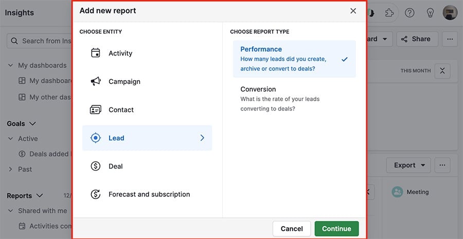
To create a lead performance report, click on “+ Create” > Report > Lead > Performance.
Customizing your lead performance report
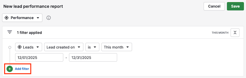
Note: The graphs in the report will reflect any changes made to the filters.
If you want to narrow your results, you can add filters by pressing “+ Add filter.”
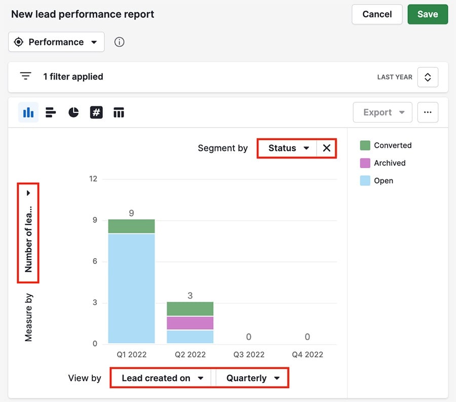
You can also customize the parameters of your charts using the view by, segment by, and measure by menus.
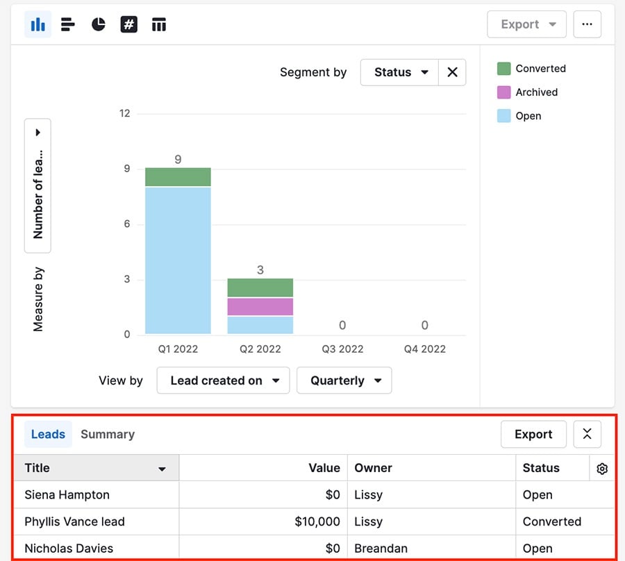
The table underneath your chart gives a list view display of the data in your report, and you can click the gear icon on the right side to change the columns.
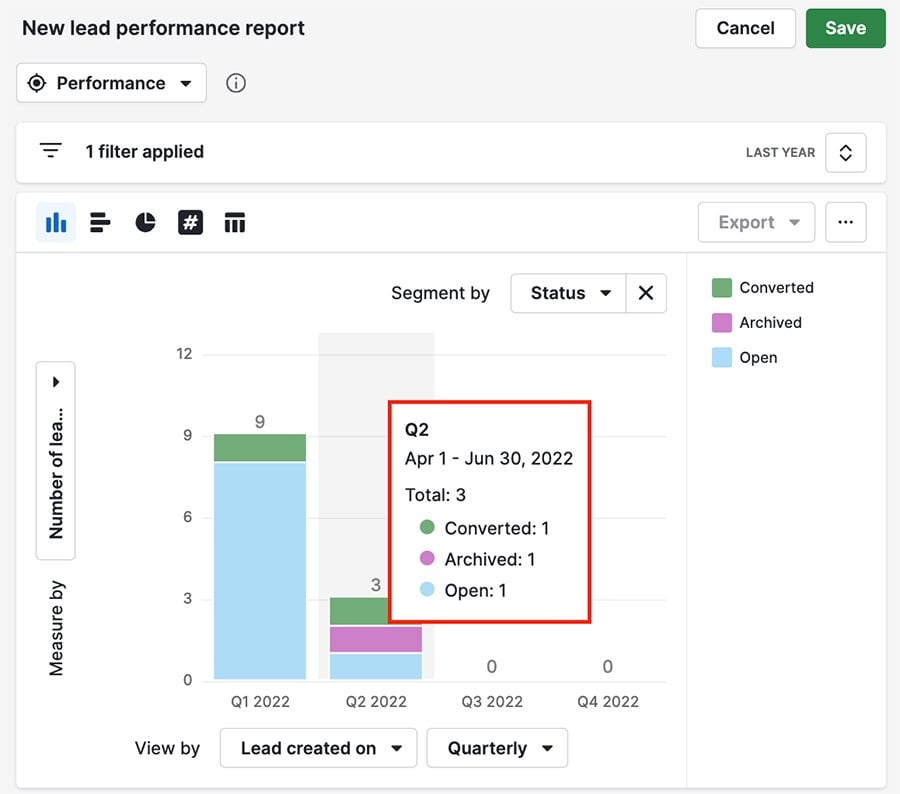
If you hover over one of the bars in your chart, you can see the specific data represented there.
Was this article helpful?
Yes
No