Comparative insights
Comparative Insights lets you compare the performance metrics of two or more email marketing campaigns in one single chart, so you can identify winning subject lines and email layouts.
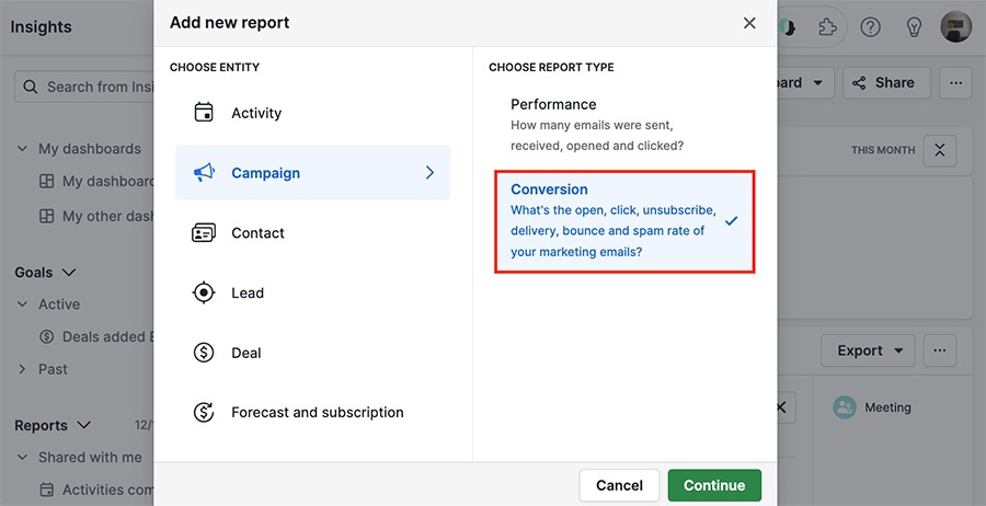
Creating your comparison report
To create the report, go to Insights then click ”+“ > Campaign > Conversion.
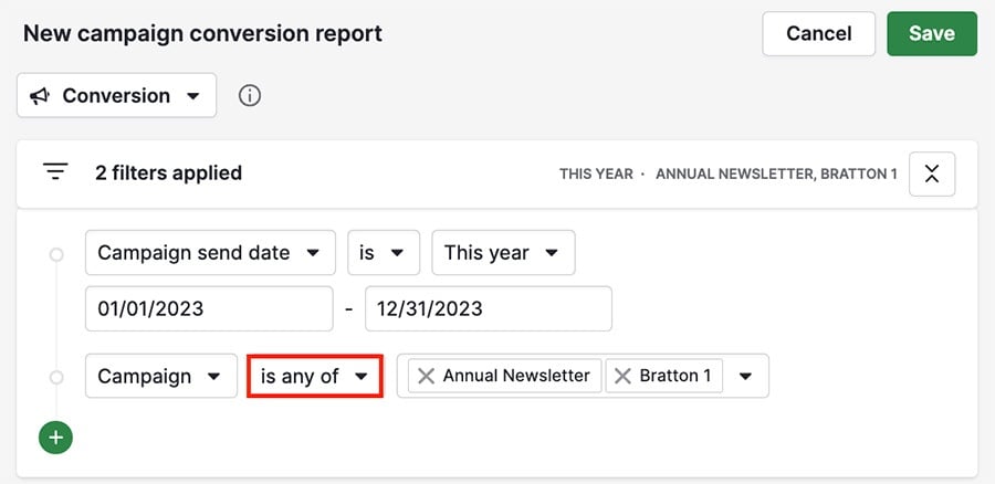
Use the ”+“ to add your desired filters, but to compare your campaigns you’ll need a filter for:
Campaign > is any of > [insert desired campaigns]
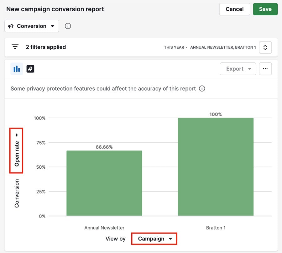
Viewing your comparison report
The comparison report chart has two different sections:
Measure by (Y-axis)
View by (X-axis)
Hover over a column in the graph to see more information about the chosen data in that segment.
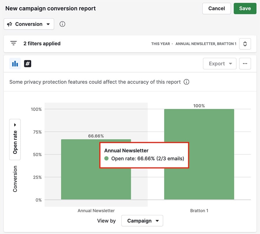
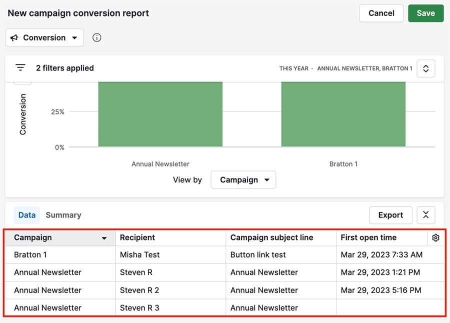
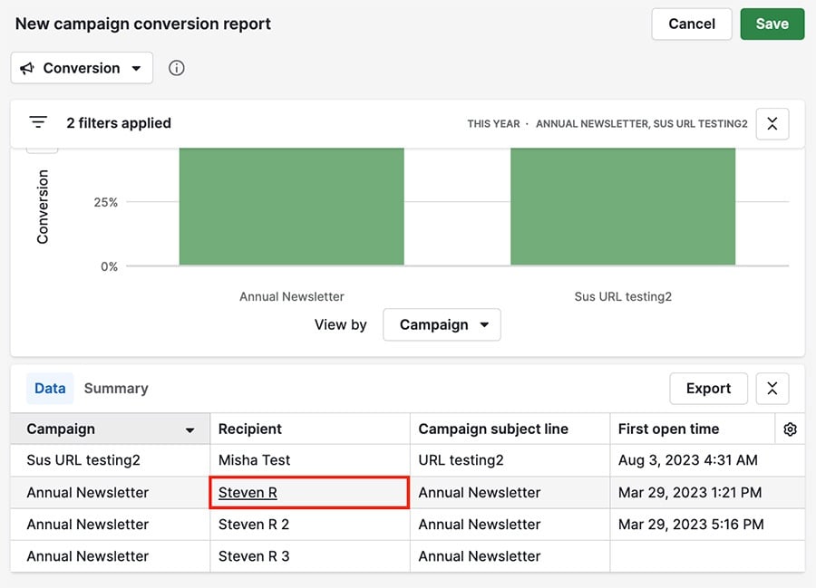
Table view
At the bottom of the page, the table view contains a breakdown of the campaigns displayed in the report, along with the information from their respective fields.
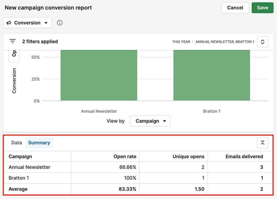
Within the table view, you can also see a brief list of data by clicking on “Summary.”
If you have the recipient column visible, you can click on any recipient to open the contextual view for that contact.
Was this article helpful?
Yes
No