Insights reports: chart types
The Insights feature lets you customize and display your report data in many ways, including different types of charts, so you can see your data in a way that best suits your needs.
Chart types
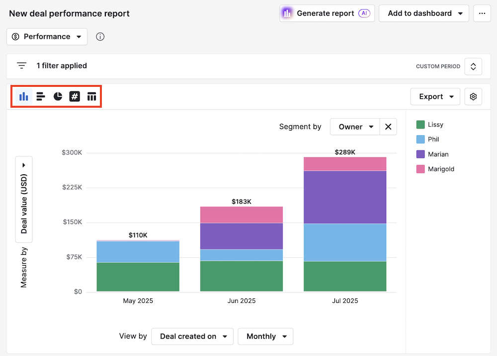
When editing a report, you can change the chart type by clicking the different chart icons on the top left of the report area. There are five different chart types available in Insights:
- Column chart
- Bar chart
- Pie chart
- Scorecard chart
- Table chart
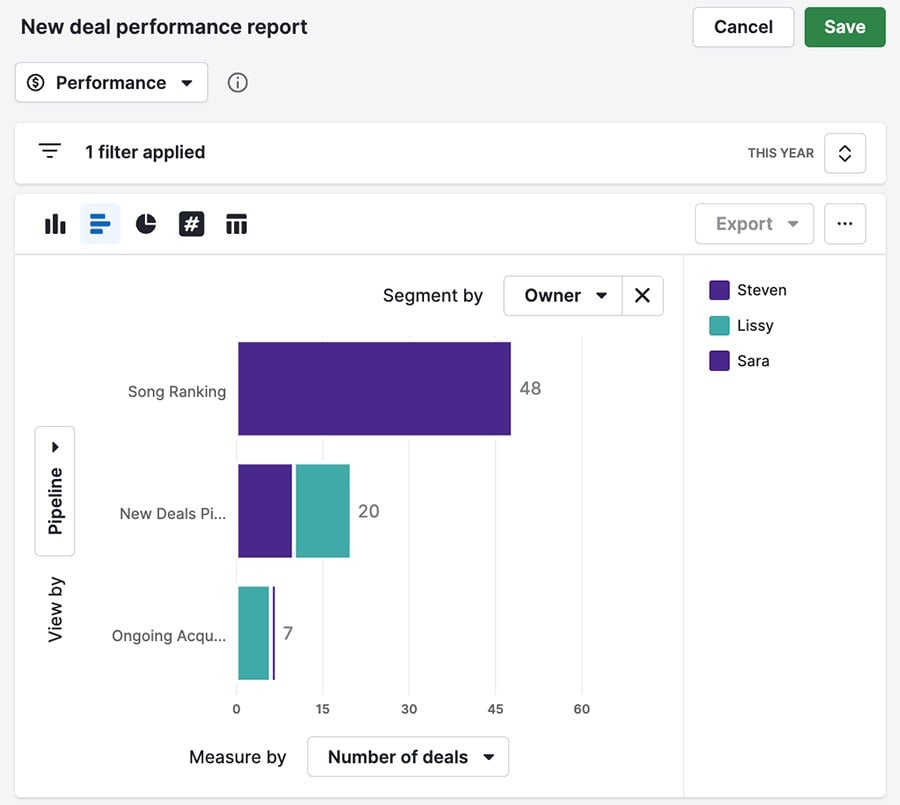
Column and bar charts
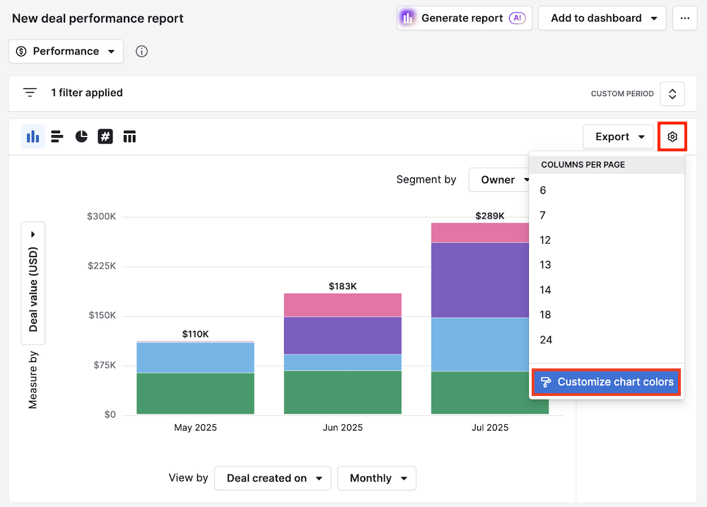
You can change the number of bars in your chart by clicking the “gear icon” at the top right corner and changing the number of columns per page displayed.
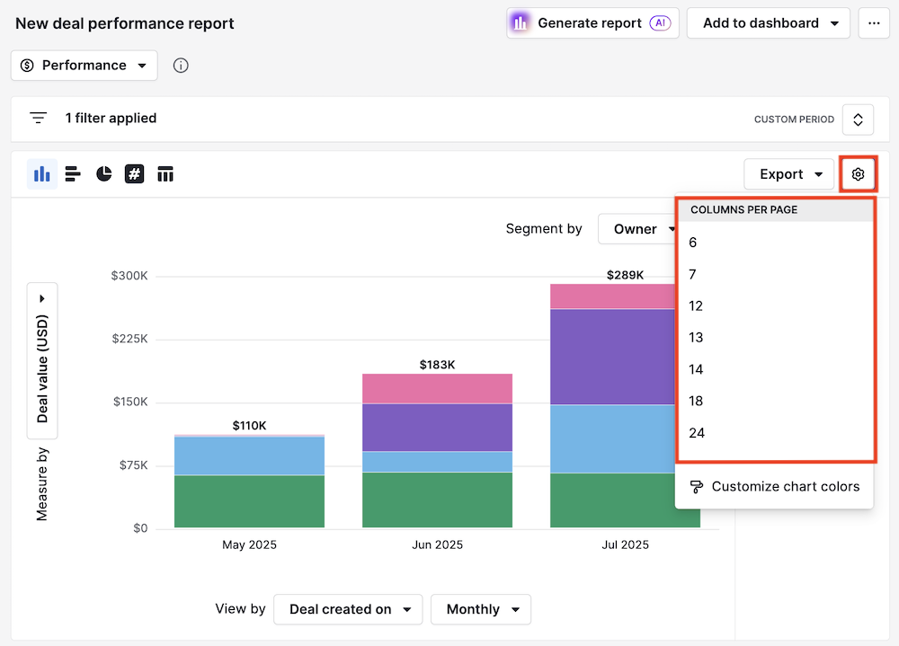
If you want to change the colors of the data points in your chart for better visualization, click “Customize chart colors.”
With column and bar charts, you have three fields for organizing your data:
- Measure-by (Y-axis)
- View-by (X-axis)
- Segment-by (not mandatory)
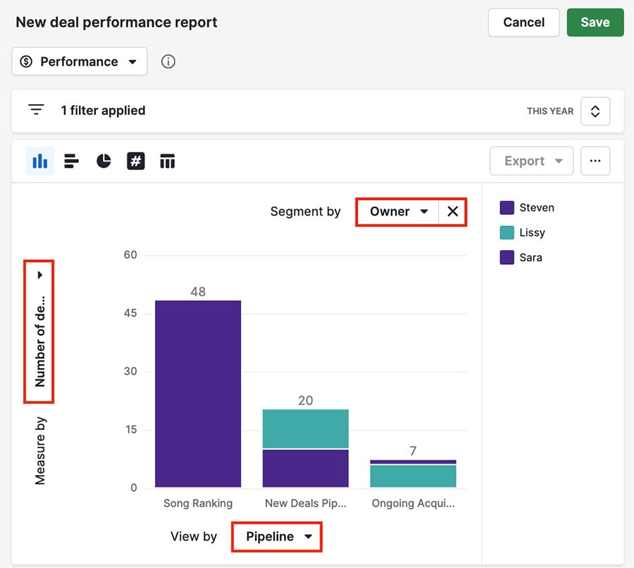
The bar chart has the same fields, but the view-by and measure-by fields are switched.
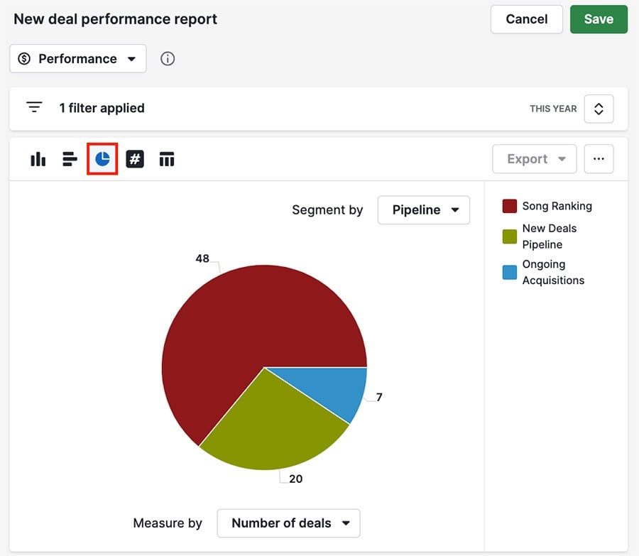
Pie charts
Pie charts include measure-by and segment-by fields, but unlike column and bar charts, they don’t feature a view-by field.
Scorecard and table view
The scorecard chart shows the total for a chosen metric (number of activities, lead value, etc.)
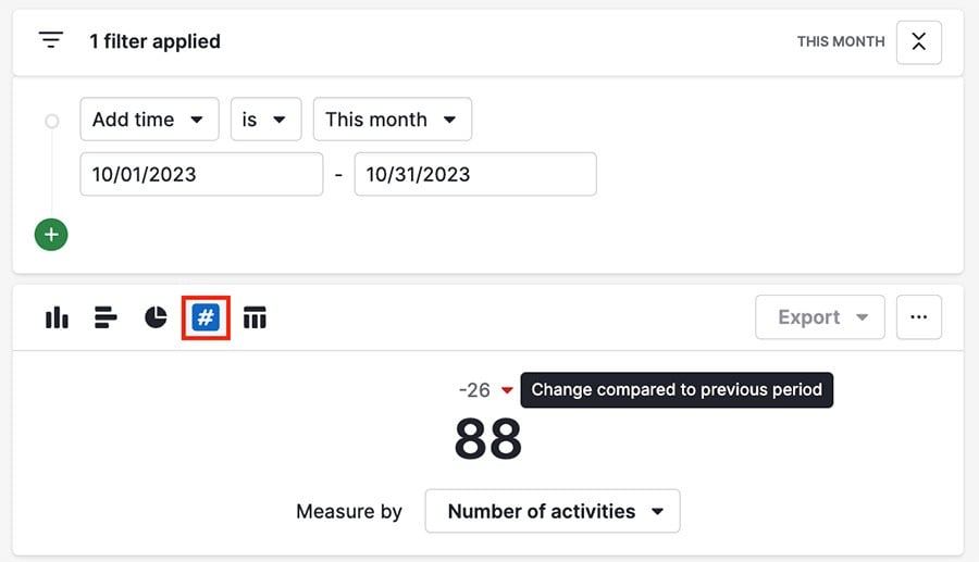
The smaller number and colored arrow above your scorecard show if the value has increased or decreased in the specified time interval, and by how much.
In this case, the number of activities has decreased by 26 since last month.
Table
With the table chart, you can see your data as a customizable list, similar to the list view.
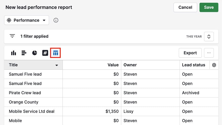
You can:
- Choose which columns appear there using the gear icon
- Drag your columns to change their position
- Click on any column header to organize the data in that column
You can also click “Export” to download a spreadsheet (XLSX or CSV) of your report data.
Was this article helpful?
Yes
No