Insights reports: deal performance
The deal performance report gives you an overview of how many deals were started, won and lost in your Pipedrive account.
Creating your performance report
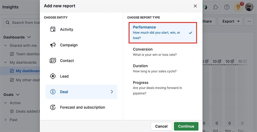
To create a deal performance report, go to Insights and click “+” > Report > Deal > Performance.
Viewing your performance report
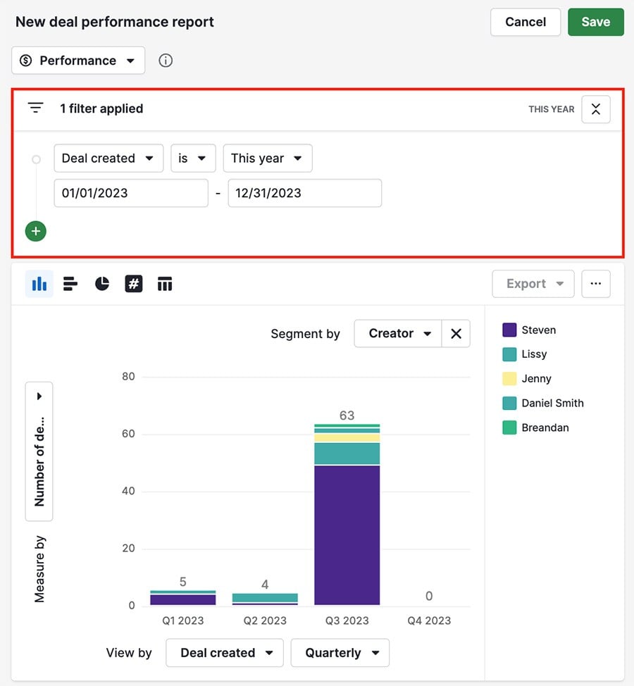
There are three sections in your performance report that let you see and edit the report’s data: filter view, visual builder and table view.
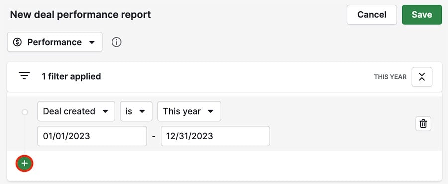
Filter view
The filtering section lets you refine the data you want represented in your report.
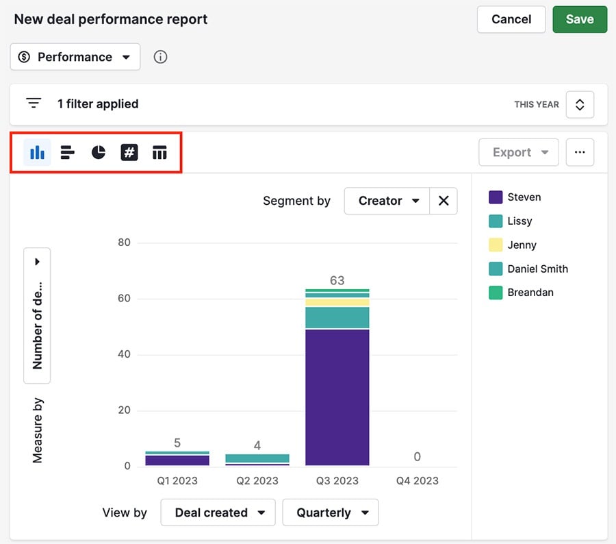
Visual builder
Below your filters is the visual builder, where you can visualize your data using charts.
You can choose from five different chart types:
- Column chart
- Bar chart
- Pie chart
- Scoreboard
- Table
You can also hover over any of the columns in your chart to see a summary of that column’s data.
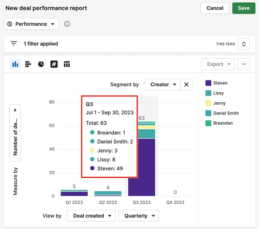
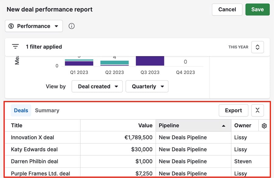
Table view
Below the visual builder is the table view, where you can see your report’s data in a simple list view format.
Editing your performance report
Each section of your performance report offers ways to adjust the data in the report or the way it’s presented.
Filter view
You can add new filters to your report by clicking the ”+“ in your filter view, or remove a filter by hovering over it and clicking the trash can icon.
Visual builder
You can change the field data present in your chart using the view by, measure by and segment by options.
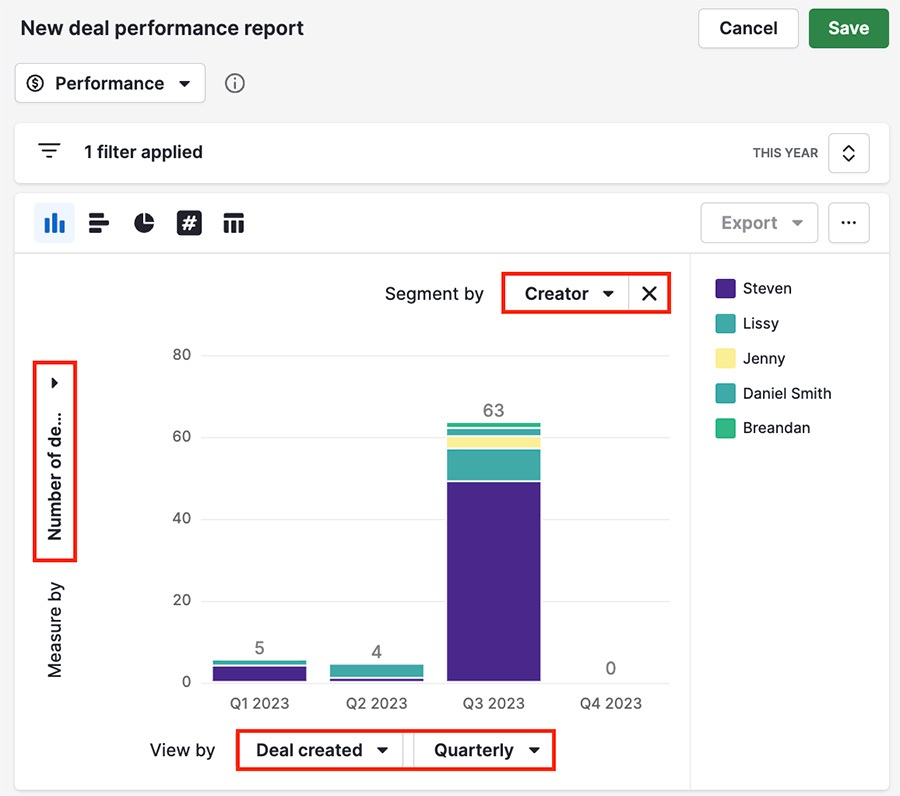
You can also click the ”...“ in the top right corner to customize the colors in your chart or change the number of visible columns.
Table view
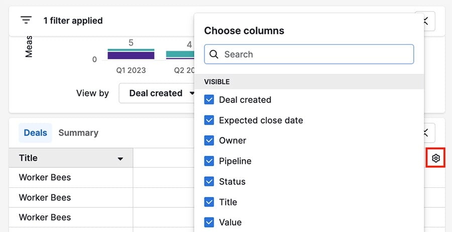
You can drag the column headers in your table view to change their order, or click the gear icon in the top right corner to change which fields are visible.
Once you're finished adding the details to your report, you can add it to your dashboard or share it with your team.
Was this article helpful?
Yes
No