Insights reports: project performance
The project performance report in Insights helps you understand how your projects are being delivered. It focuses on delivery performance, so you can quickly see how many projects are active, identify delays and balance your team’s workload.
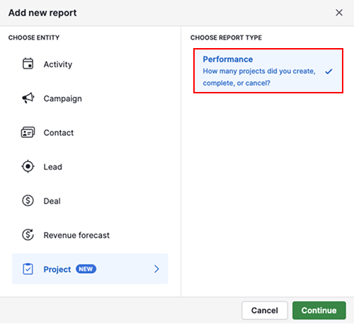
Create your project report
To create a project performance report, open the Insights tab and click “+ Create” > Report > Project > Performance.
View your project report
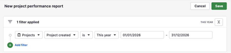
Your report is divided into three main sections: filters, the visual builder and the table view. These sections are connected, so any change you make updates the entire report.
By default, the report shows projects created this year.
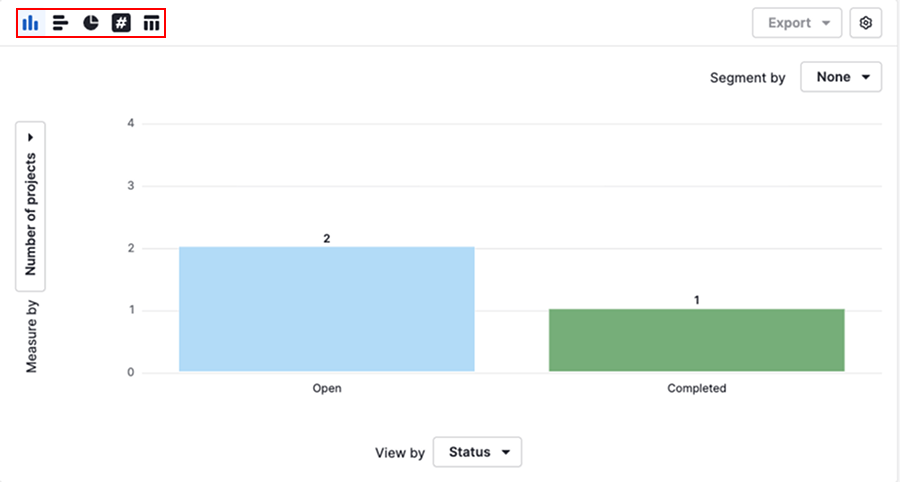
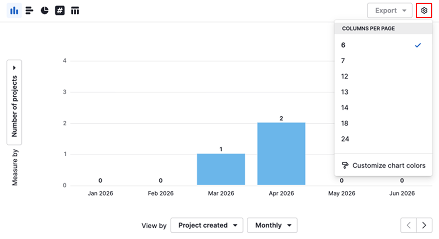
The visual builder displays a column chart showing you the number of projects created each month and how they’re distributed by status.
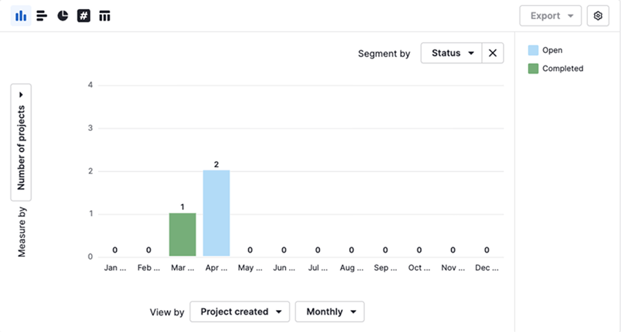
You can click on any column in the chart to see which projects are included in that specific data point.
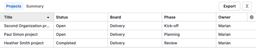
The table view below shows all projects that match your current filters.
Edit your project report
You can customize the report to focus on the data that matters most to your team.
Filters support combined data, allowing you to narrow down projects using linked deal, person, organization or activity data. However, the visual builder and table view only use project-related fields.
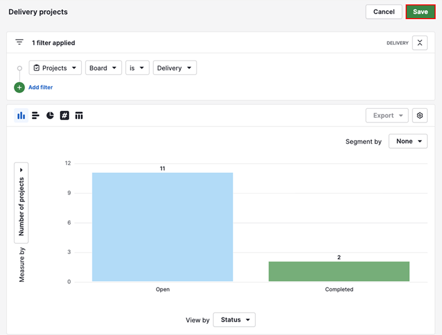
Filter your data
Filters define which projects are included in your report.
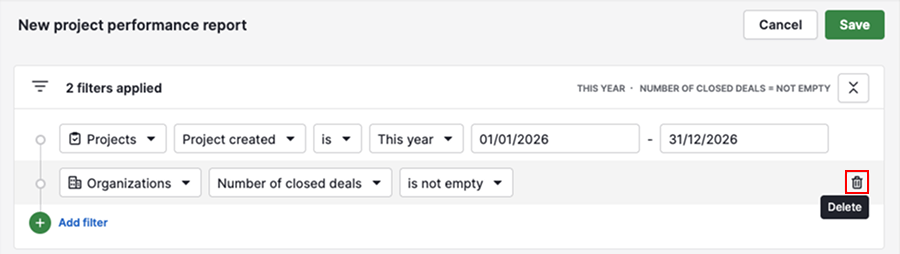
Click “Add filter” to narrow down your report using project fields or combined data.
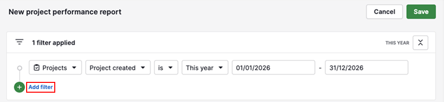
To delete a filter, hover over it and click the trash can icon.
Use the visual builder
The visual builder controls how your data is displayed.
By default, the report uses a column chart, but you can switch to a bar chart, pie chart, scorecard or table view depending on how you want to analyze your data.
Click the gear icon to adjust display settings, such as the number of columns per page and chart colors.
To structure your data in the chart, use the following metrics:
| Metric | Description | Example |
|---|---|---|
| Measure by | Defines numerical or monetary values | Number of projects |
| View by | Determines how the data is grouped | Project created date, owner |
| Segment by | Splits the data into categories for comparison | Status |
Changing these options helps you explore trends, compare performance and uncover patterns across projects.
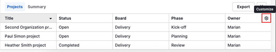
Customize the table view
The table view shows a detailed breakdown of your data.
You can choose which fields are visible in the projects tab by clicking the gear icon and selecting the columns you want.
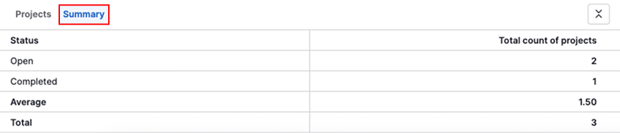
You can also switch to the summary tab to see key metrics from your chart in table format.
Once you’ve finished customizing your report, click “Save” to keep your changes and access the report later.
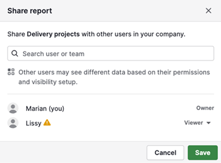
Share your project report
To share your report, click “...” > Share with users.
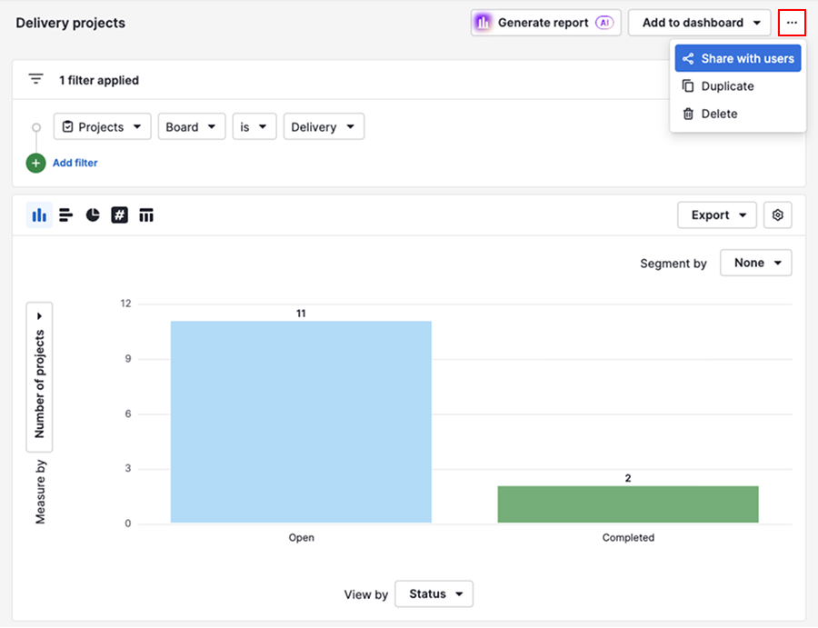
Select the users you want to share it with.
You can also add a report to a dashboard and share the dashboard with other users.
Alternatively, you can export the report data from Insights and share it externally. For more information, see exporting data from Insights.
Was this article helpful?
Yes
No